Momentum Data Visualization Library
Navigating uncharted territory and innovating with new Figma features
Momentum Data Viz Library
Who
Cisco
When
2021-2025
Role
Lead designer
Overview
When I began working for Cisco in 2021, I was a product designer for the Webex Control Hub Analytics team. My primary assignment was to create, expand, and own a library of chart and graph components that the team could use consistently across products. Up to this point, there were UI designs for analytics pages, but charts were created manually, applied inconsistently, and required tedious and time-consuming work to update.
Fortunately, I had just finished a 2-year contract at Microsoft (2019-2021) where I also created and owned data visualization components. My years as a Data Visualization Engineer (2017-2019) prepared me for this niche specialty.
v1.0
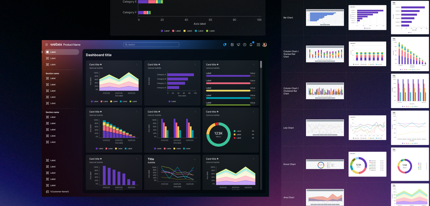
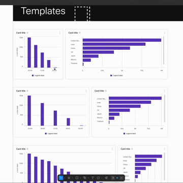
Over the course of that first year, I put together a robust component library in Figma. I used Atomic Design principles to build components from the ground up, allowing me to make swift and efficient changes as needed, and speeding up the process of what turned into hundreds of variants of each chart, graph, axis, and legend component.
When v1.0 was published, dozens of designers across the Webex Platform organization had a consistent source of data viz components as they built screens for various analytics features.
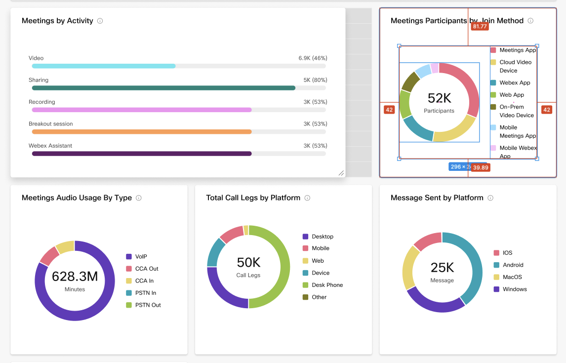
Data viz components are different than other design assets because they are dynamic. Even though buttons and dropdown menus may have variants and interactive states, they don’t visually change all that much from one application to the next.
But data often needs to tell a story. If these were like other UI elements, we could just slap a placeholder chart image on the component and use our imaginations for what real data would look like. But consumers of these components are often trying to tell a compelling user story that relies on a specific trend in the data.
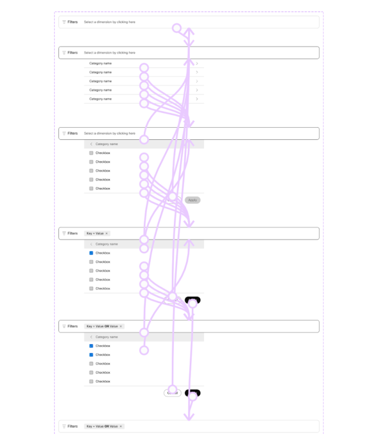
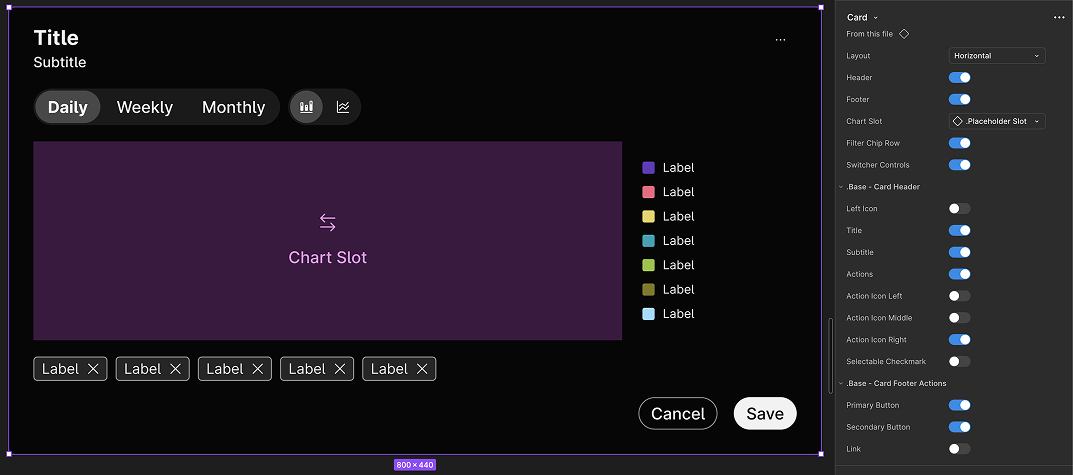
I designed components for flexibility, making sure to include variants that designers could use to make quick changes on the fly.
I paid close attention to Figma feature updates and implemented interactive components as quickly as I could. I even taught a lunch & learn class for my colleagues so that they could add the same capabilities to their components.
Aging, and not gracefully
By 2023, team priorities had shifted away from analytics features and by 2024, I had transferred roles to work on design systems instead of products.
The data viz library lived on, but slowly grew stale as the products around it refreshed their visual patterns and Figma added new features that solved some of its earlier challenges. I had a growing wish list of updates I had wanted to make but had been too busy with more pressing matters.
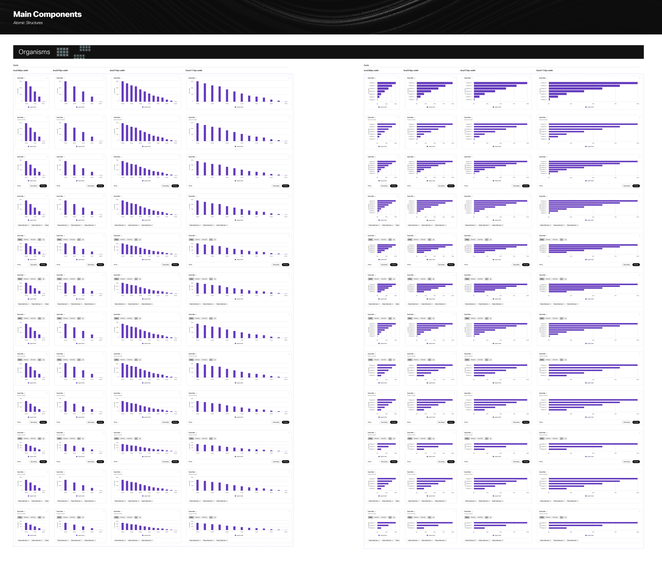
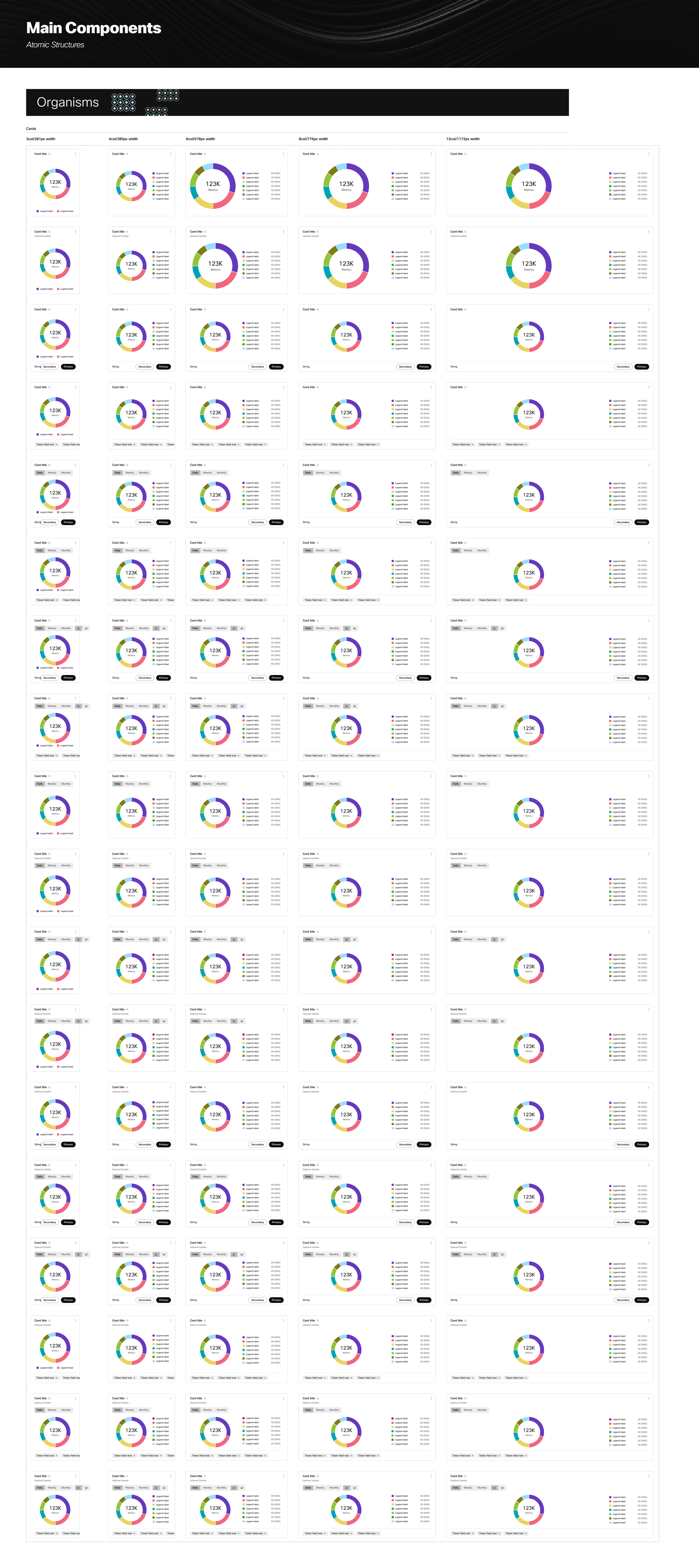
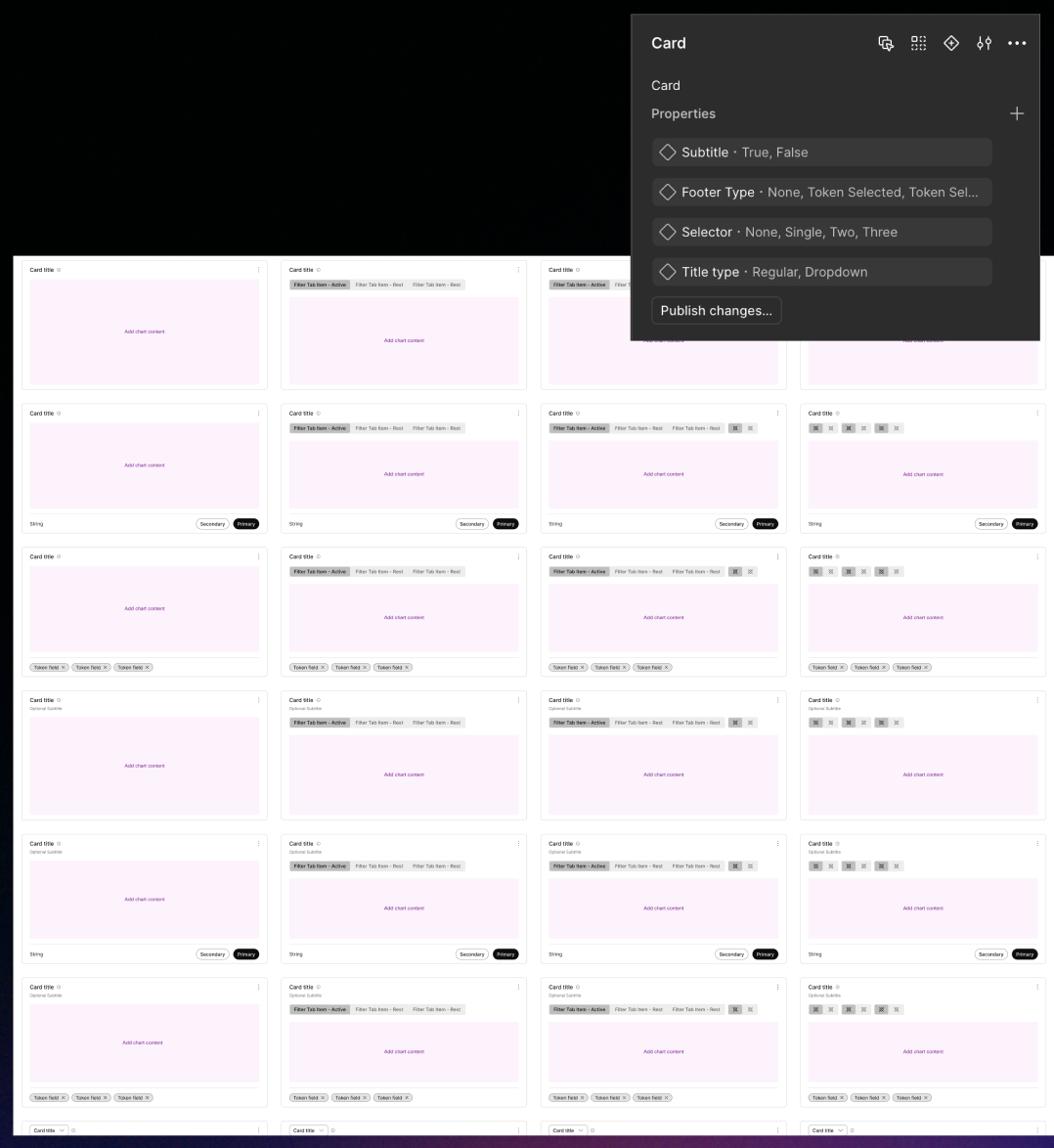
Among that list, I knew I could eliminate the 48 unique combinations of card variants that had become obsolete once Figma introduced Boolean Properties.
v2.0
In 2025, an opportunity arose as new products within our larger design system began to need charts and graphs as well. Rather than refer them to the old library I was no longer proud of, I started from scratch and used all of the lessons I wished I had learned prior to the first version.
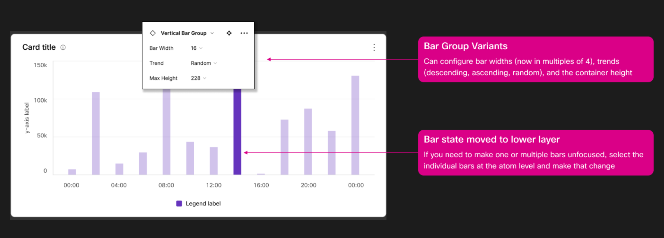
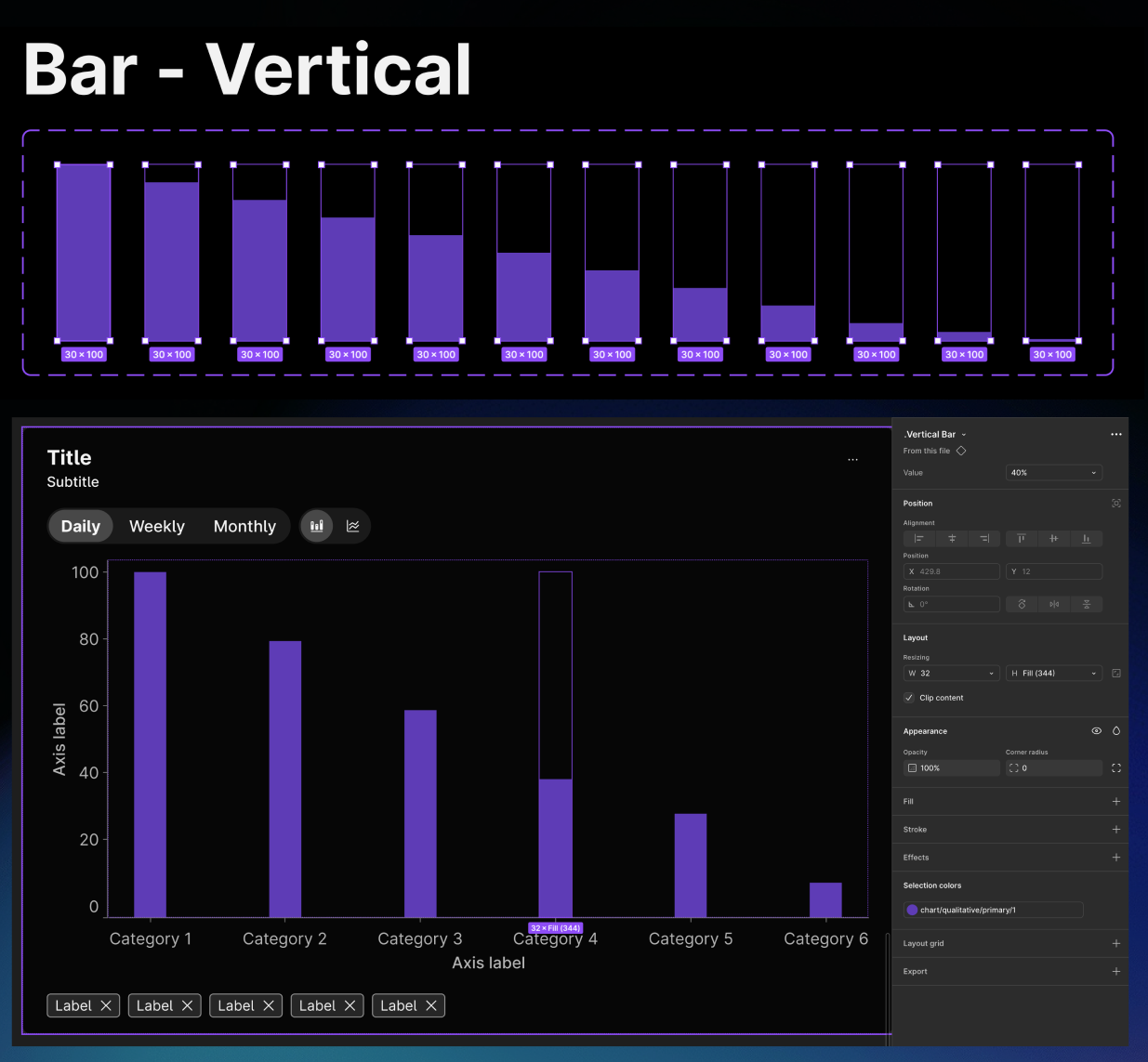
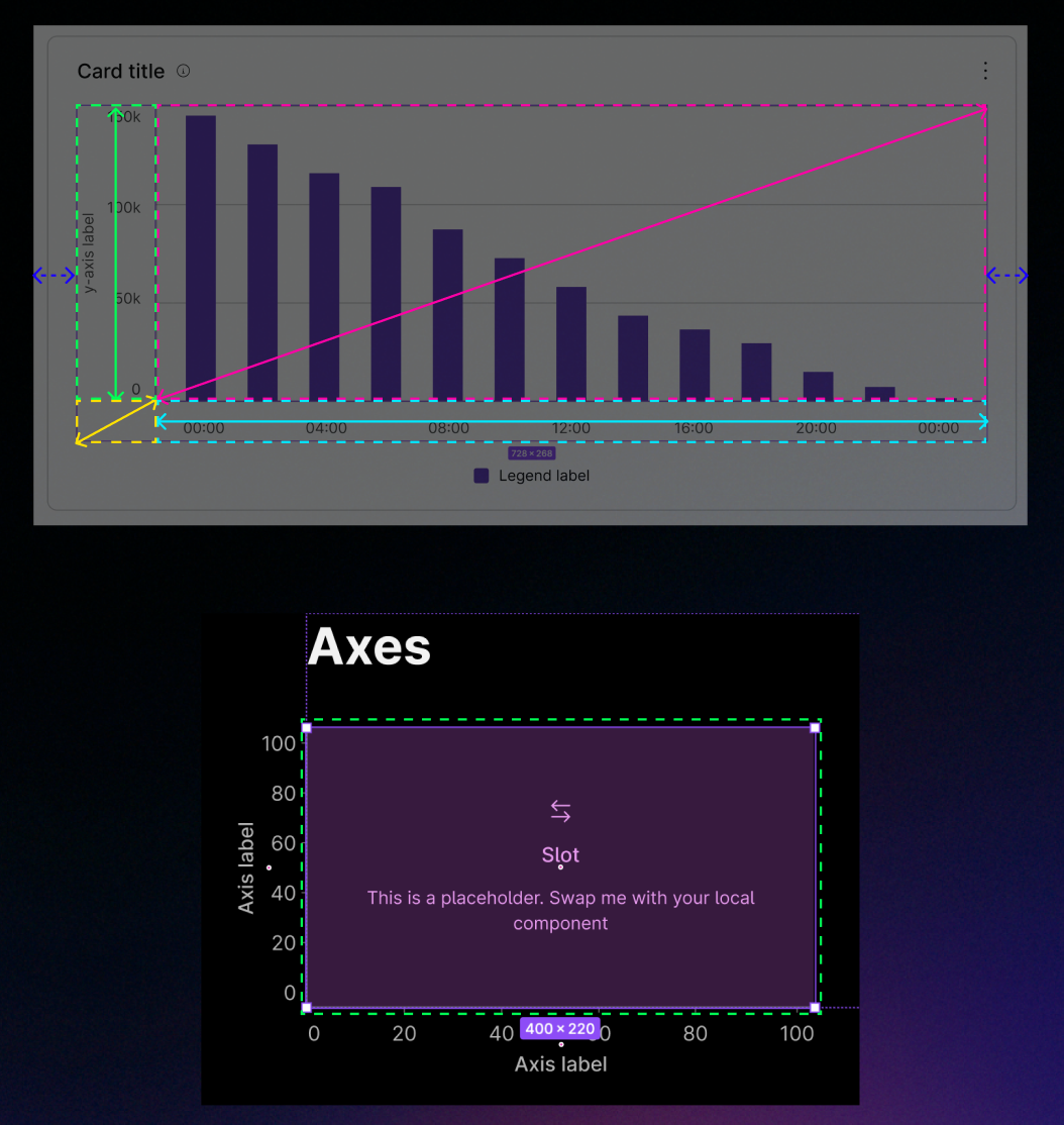
In the original library, I had never quite figured out how to create data bars that scaled consistently for a chart of any height. After all these years, I realized how I could use negative space and scaling constraints to create bars at different height increments and swap them in and out of any size chart.
I had also spent years frustrated by some of the scaling issues that had plagued my original card components.
I unleashed the Figma nerd and the geometry nerd in me as I realized that different pieces of the chart need to scale at different proportions as the card grows. And by using slots and a more creative use of boundary frames, I could completely resolve that scaling issue.
Conclusion
After four years of headaches, it was cathartic to launch a new data visualization library that was truly flexible, scalable, and lean. Because I had built this new library with plenty of foresight, the baseline structure allowed me to copy, edit, and produce new chart types 10x faster than the original library. The result was a new library that offers bar charts, line charts, donut charts, area charts, stacked bar charts, clustered bar charts, pie charts, and more. These components have allowed new teams to begin imagining what their UI might look like with real data, and to manipulate those interfaces to tell realistic, compelling user stories.