
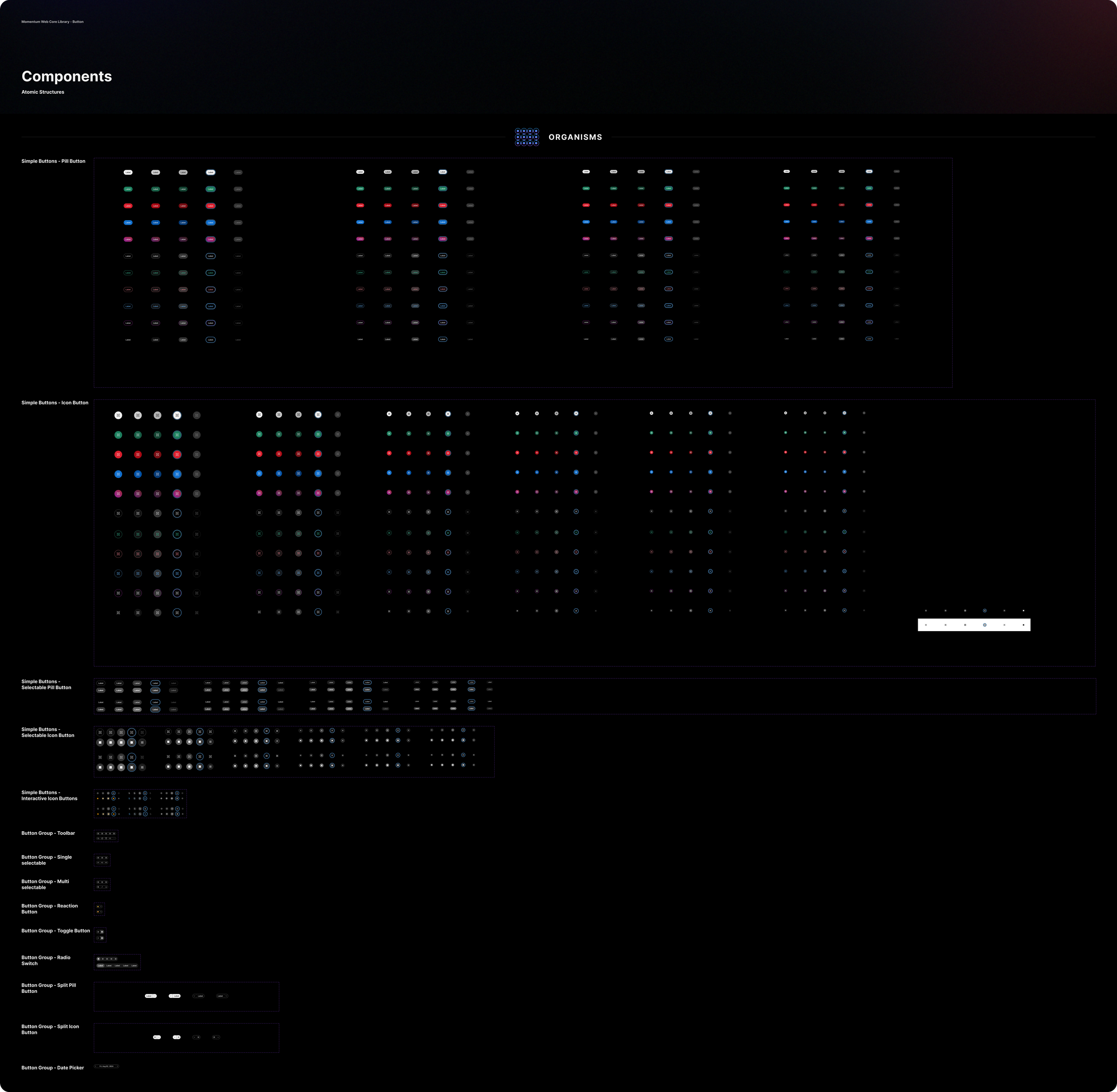
Welcome to the Button Factory
My approach to making complex, flexible, usable Figma components
Momentum Web Component Library
Who
Cisco
When
2021-2025
Role
Senior product designer
Overview
After years of early career struggles to find my design identity, I found comfort in the unique needs of design systems: I get to design assets for other designers, who themselves are designing for end users. With the Momentum Design System at Cisco, I had the opportunity to create, organize, and construct 50+ types of UI components used by 150+ designers and influencing products used by 30M+ end users.
And that’s where I really learned to shine. From 2021 to 2026, Figma grew from a basic tool to a complex suite and I excelled at learning all of its features. At the same time, our design system grew, rebranded, reorganized, and faced concerns about scalability and bloat.
For me, it’s a truly fun design challenge to re-architect a component in a way that is flexible, scalable, and contains the kind of foresight that will save time down the road. Along the way, I had to learn how to temper these skills to make sure my components aren’t too complex for my users.
The Button Factory
One of my first assignments as a budding design system designer was to create the button components for our new design library.
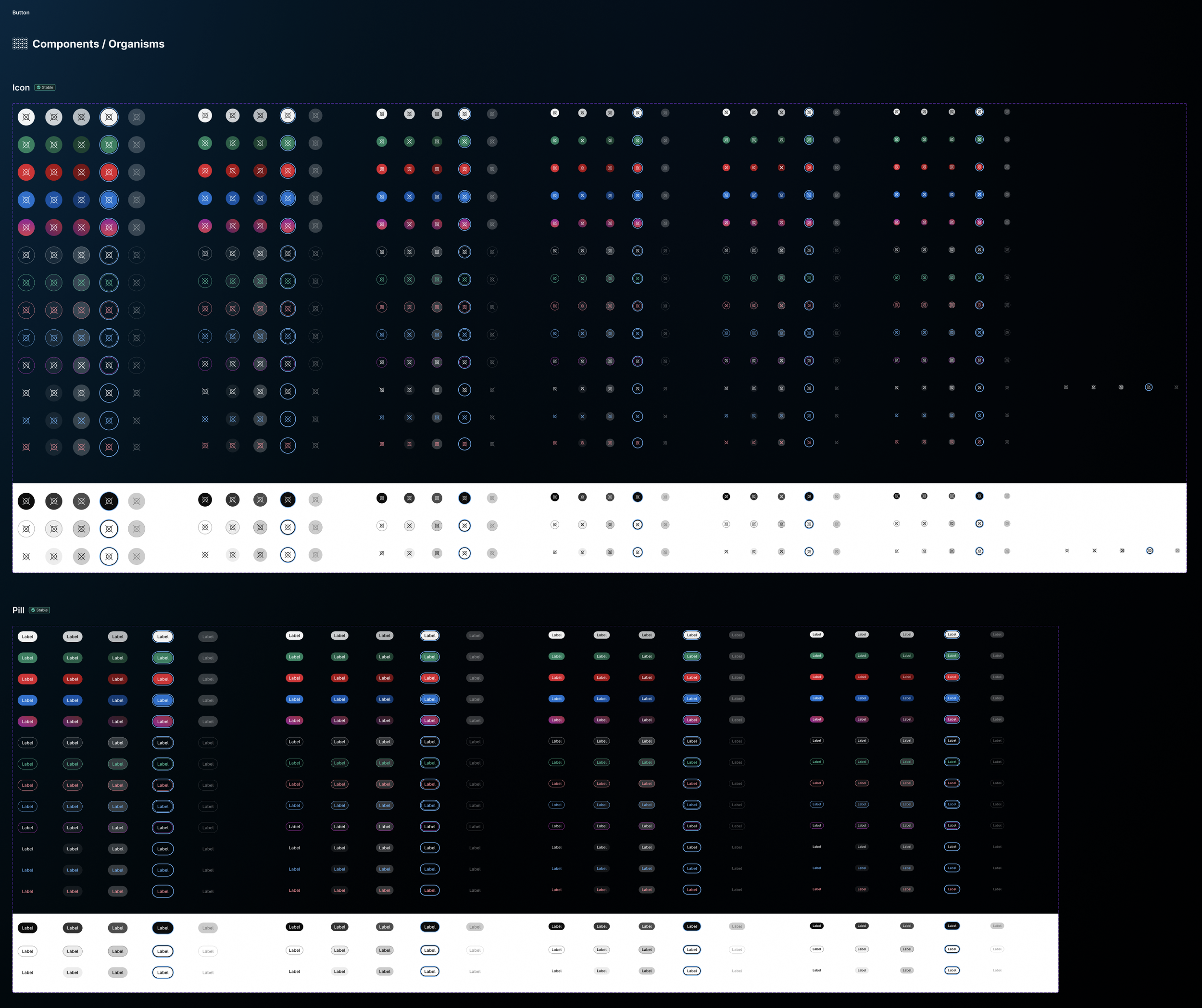
One problem that stood out to me was that we had dozens of different button types (pill buttons, icon buttons, pill buttons with an icon on the left, pill buttons with an icon on the right, etc.). Each of these buttons was constructed independently, which meant that when we updated our font styles, size options, or background colors, we had to update these manually each time for each button. (Note: this was long before Figma made the process easier with tokens and variables).
I devised a clever way to reconstruct these buttons using our existing Atomic Design principles, but having all button types stem from a single source of truth, sharing common colors and styles wherever possible.
The result? A 90% reduction in maintenance needs for these buttons. Updating the font style at the source propagates across all downstream buttons. But also, some really confusing-looking intermediate assets to the untrained eye.
![Various buttons with descriptors, for example "what we call it: rest, primary, default" and "what defines it: [a list of style names]"](https://images.squarespace-cdn.com/content/v1/678dca56123ed24a1f085f8e/853fdfe4-bb18-482f-a7f6-f6a830b28b0f/Button-array-2.png)
I held on to my conviction that the benefits of this out-of-the-box idea outweighed the confusion, but I needed to stay ahead of that confusion before handing it off as a completed design. I scheduled a show-and-share for my department and created a metaphor to help explain what exactly was going on at each stage of these nested Figma components.
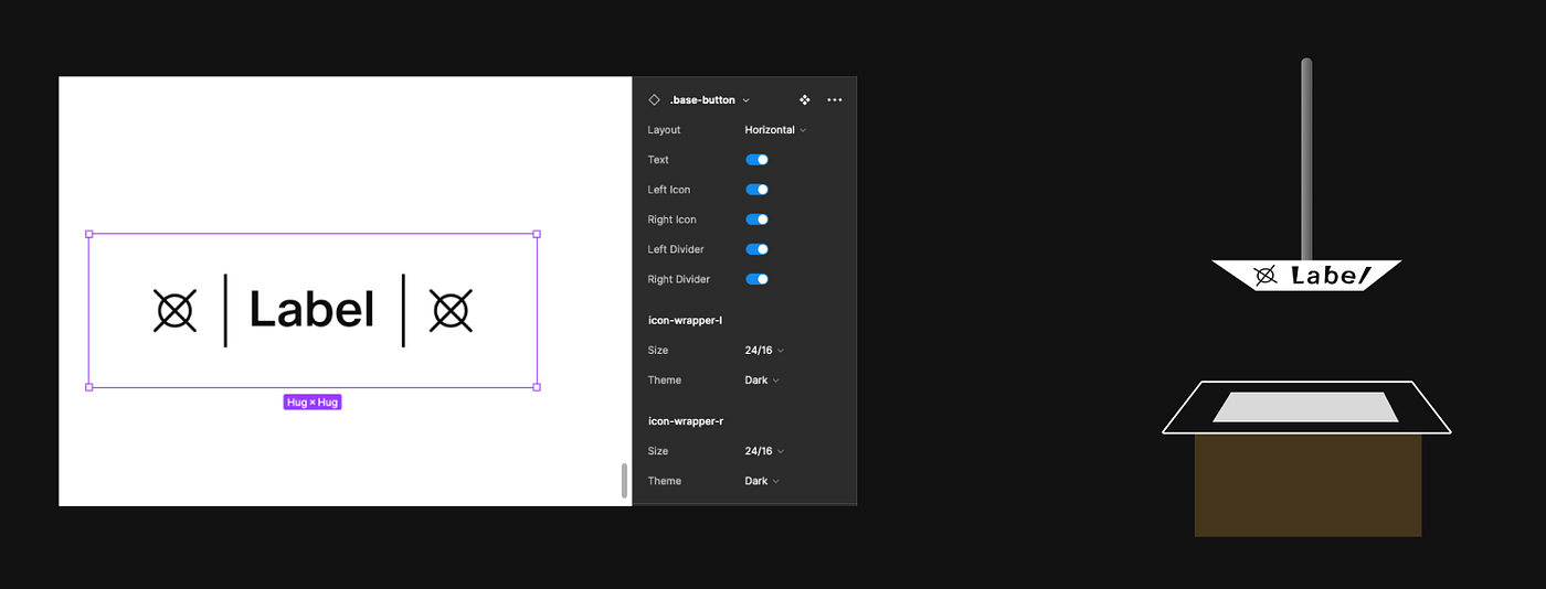
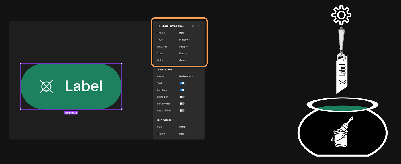
I described it as a “button factory,” where you might be stamping out buttons as if they’re license plates on an assembly line.
In Stage 1, you set your printing press with the content that would appear on the button: the text and any icons or decorative glyphs. In Figma, this is where designers would turn on or off any properties that appear on the end product.
In Stage 2, you dip these buttons into paint pots. This is where we differentiate our primary, secondary, and tertiary buttons, our accent, affirmative (green), destructive (red), and promotional buttons. This is also where we apply the background effects for hover, pressed, and disabled button states.
In Stage 3, you push and mold the button into its final shape. To accommodate our many different size buttons, this is where we set the text size and padding that differentiates them.
The main idea is that in the future, if we decided that we need to add a 44px green button with an icon on the right, we could take our existing green icon buttons from Stage 2 and simply update the size and spacing accordingly.
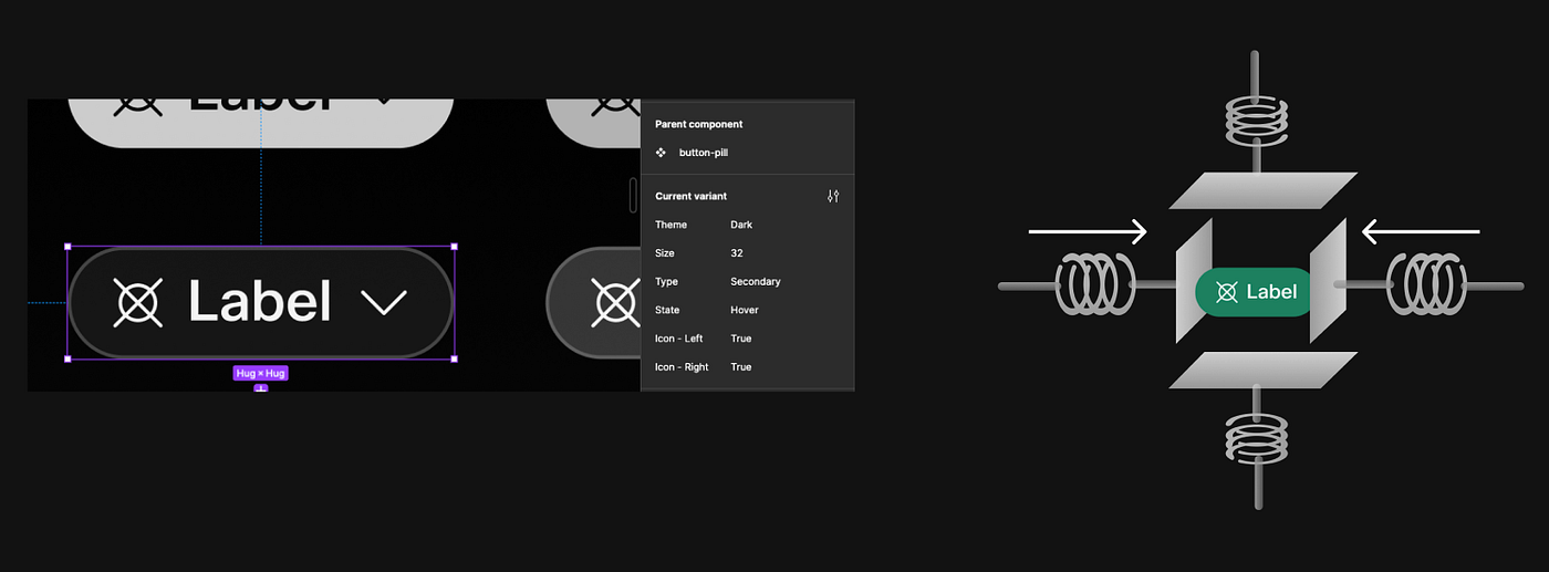
Have you ever given a presentation so deep in the weeds that by the end, you can’t tell if your audience is glazed over or stunned?
I took some big swings with this approach, but the metaphor landed, and my audience descended into a slow clap.
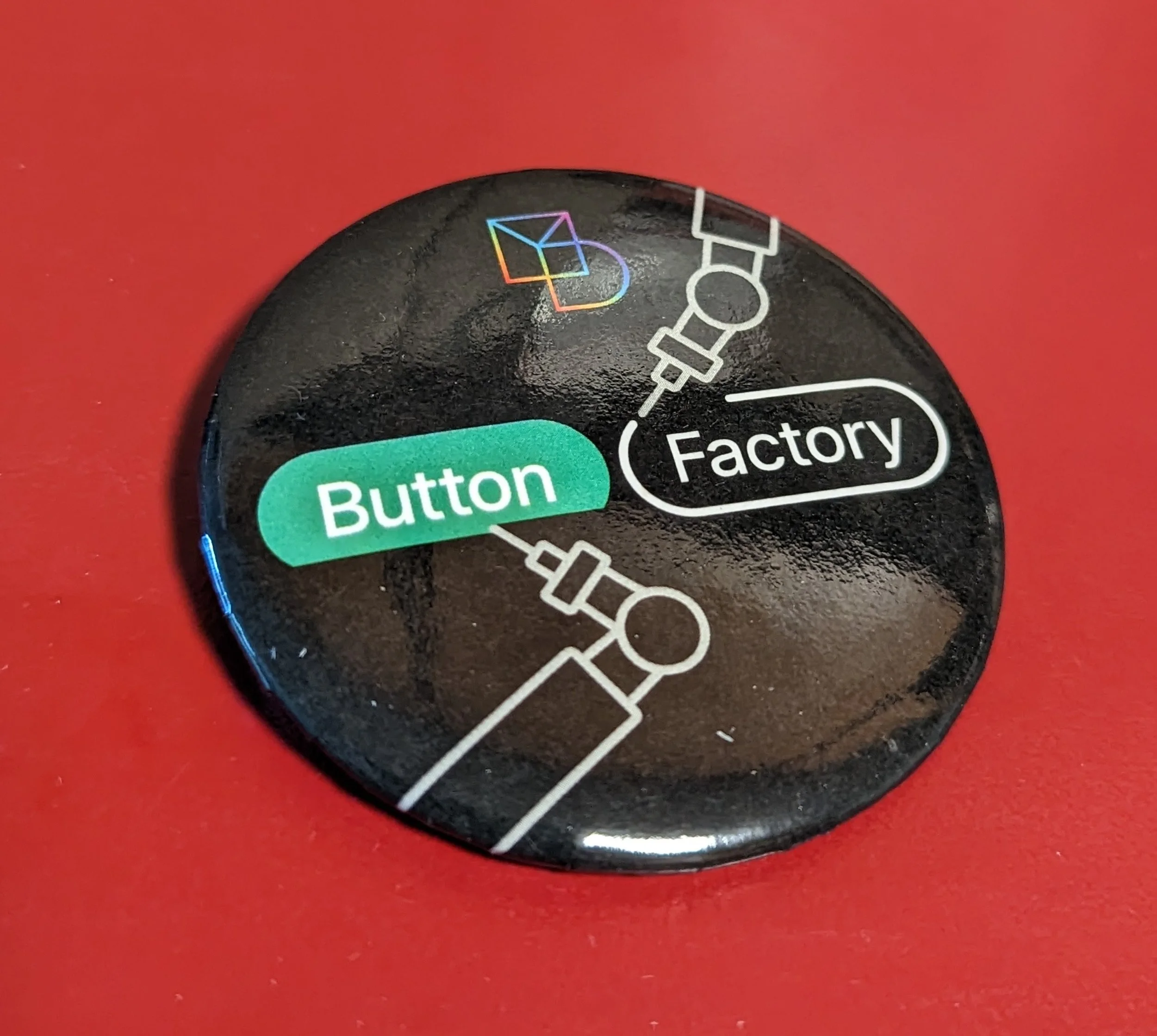
In fact, the “button factory” metaphor was so strong that it became shorthand for our team and the kind of work we do for the Webex Design organization. My director, Chris, ran with the idea and ordered these custom (wearable) buttons as team swag.
Overdesigning a component
I didn’t always know my strengths at building components and how to exercise them with caution and care. When I was tasked with redesigning a large-size modal dialog component in 2023, I went a little overboard in my approach.
I started with good intentions. I gathered examples of every modal dialog that was being used across the product. What I found was a wide variety of use cases. Some had content in one, two, or three columns. Some had images on the left, others on the right. Some had groups of text hierarchy and others only had body text. Some used extensive iconography and others had none. As our main goal was to get everyone using a consistent component, not to change the live product, I sought to build one component that could do it all.
When I find my groove, my flow, I won’t even notice a whole afternoon pass by as I come up with a clever way to make a flexible, scalable Figma component. And by the end of the afternoon I had done just that.
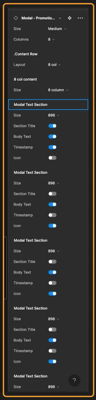
What I realized was that for all of my “success” in creating a one-size-fits-all solution, I had created something with so much precision, so rigid in practice, that it would be too difficult for anyone else to use. If a designer tried to tailor the modal to their unique needs but couldn’t find the right options to do so, then they would give up, detach the component, and my new component would be rendered futile anyway.
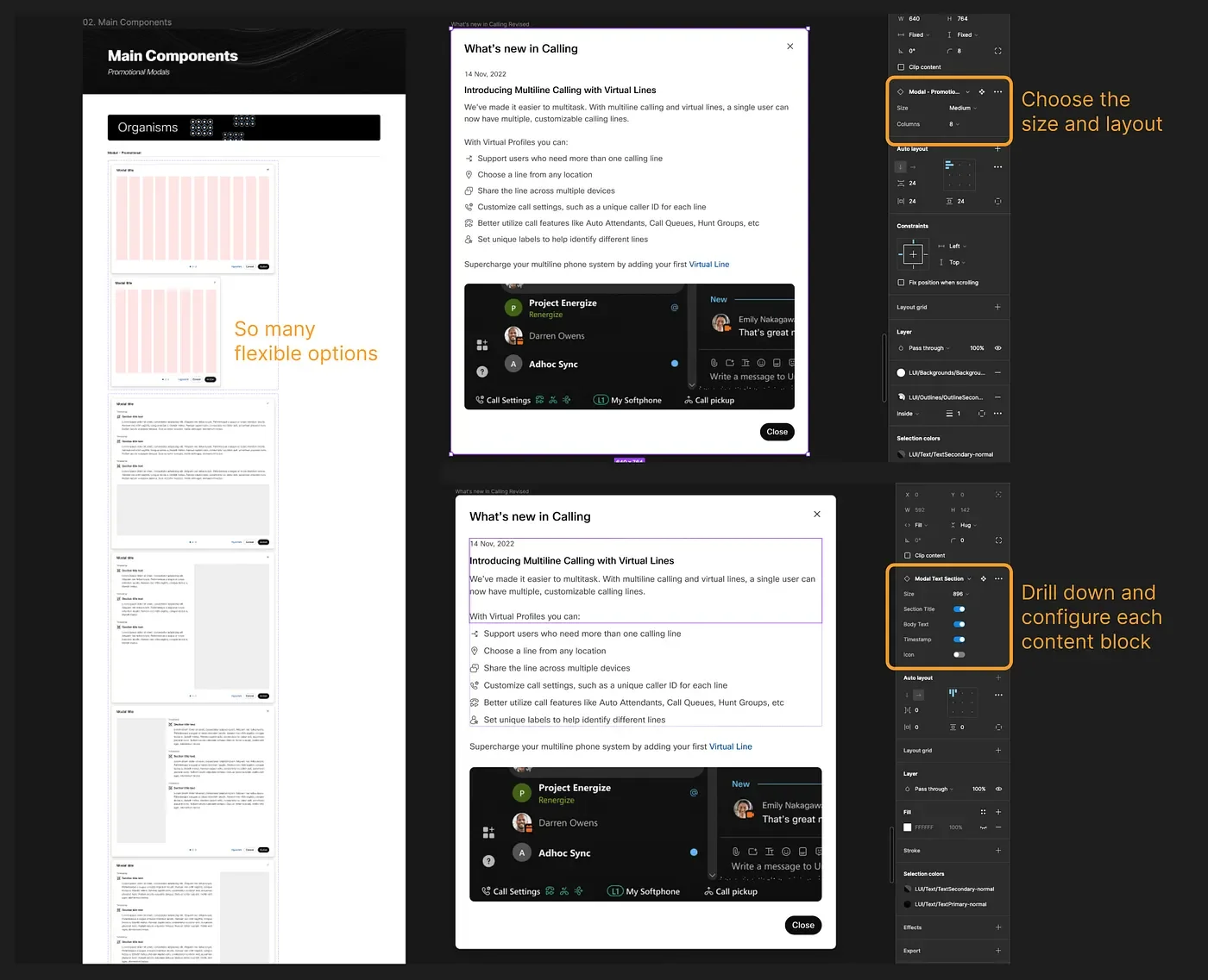
Instead, I dialed back the complexity of my solution. Rather than make it so prescriptive, I gave agency to the end users. I created a modal template toolkit. This allowed a designer to assemble as many content blocks as they desired, customize them to their needs, and align to a provided 12-column grid system.
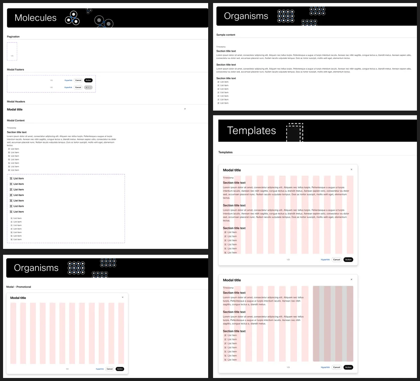
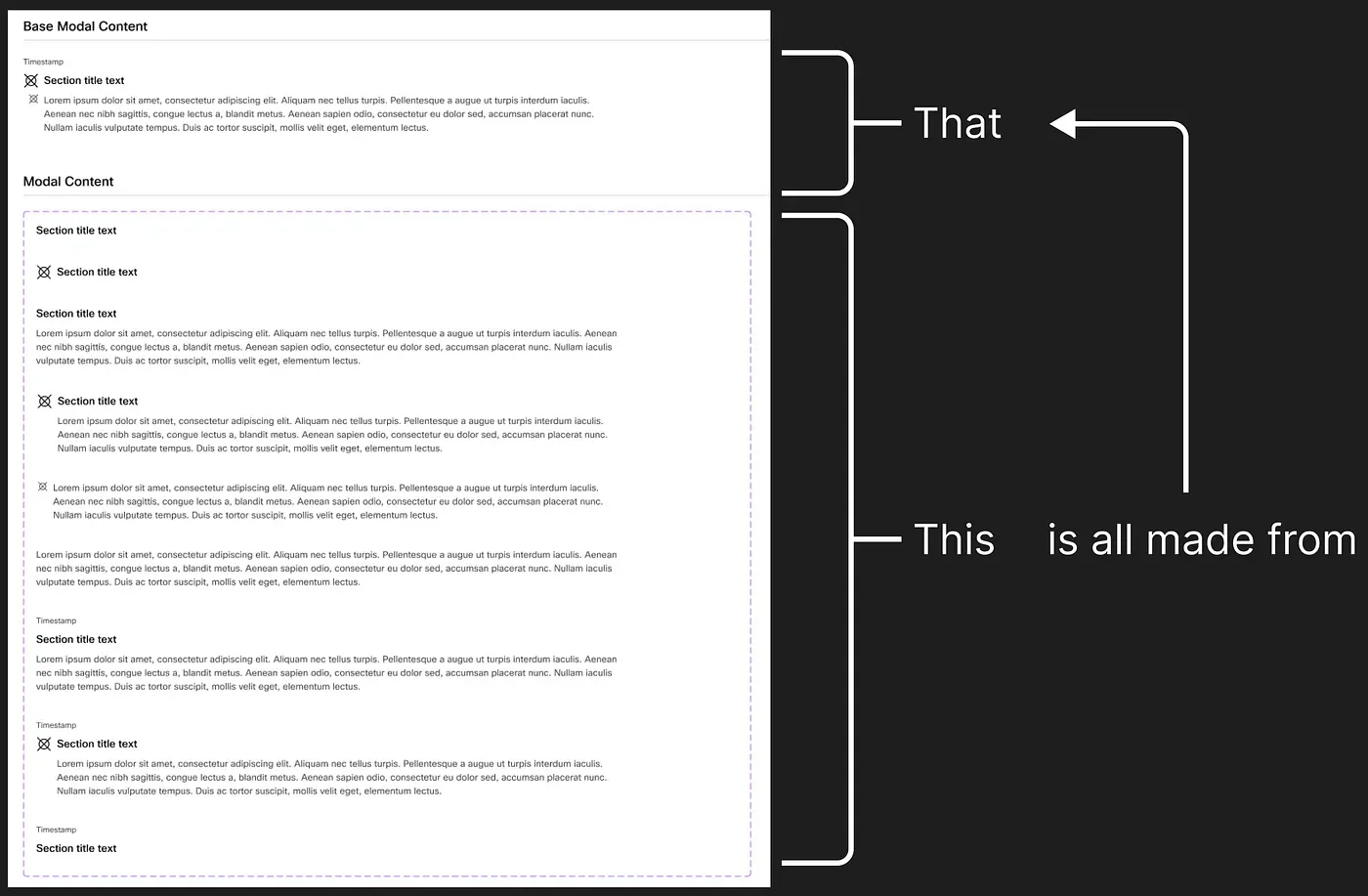
I created a great set of nested building block components, so that one single content block could handle the many combinations of section titles, body text, icons, and timestamps that might appear in a modal. Then I layered these onto the component in columns with auto-layout, so the end user could easily swap from a single column layout to a one-thirds and two-thirds layout or any combination they desired.
In theory this was great. But in practice, this meant that each modal component would have dozens of hidden content blocks and layers “just in case.” And in order to configure to their needs, they would need to navigate into stacks of component properties in the right-side panel and choose from an unmanageable list of options.
Continuous improvement
I never stopped looking for ways to improve the components in the Momentum Web Library, but as I matured in my design practice, I got better at framing the problem, analyzing the risks, weighing the benefits, and persuading stakeholders for buy-in ahead of time.
Long after the “button factory” phase of our components, we ran into additional issues with the way the buttons had been designed. These issues had been tradeoffs in the past, and I had good reasons at the time for giving our team so much flexibility. But that flexibility meant that our end-users could start editing properties that would violate our usage guidelines, and it’s a sloppy look to rename these layers as “Please don’t change.”
Over time, Figma had added features that made bulk editing easier on my end, so what was initially a valid tradeoff was no longer true. We had a good case to make this change, but it was going to create a headache for anyone who would need to migrate from the old button structure to the new one.
I brought this proposal to a design critique, presented the problem, historical reasoning, potential options, risks, and benefits. With my team’s buy-in, we agreed to “flatten” these buttons to use fewer layers, require fewer clicks to edit, and hide the properties that shouldn’t be touched.
From there, I created a migration plan and put together a testing matrix to know for sure which existing button properties would be overridden. Not only was the migration successful, but by removing obsolete elements from the base buttons, I removed 23% of the 10,000+ layers in the library page, which sped up the file for all of our users.